Rethinking Ivygo's Host Experience
Streamlining the host-side UX from booking approval to payout for the Electric Vehicle community charging app, Ivygo.
Length of Read
15 mins
Duration
9 weeks

The Brief
The Brief
Ivygo is a peer-to-peer EV charging platform that allows users to rent out their home chargers.
This project was done in collaboration with Ivygo to improve the Host experience, focusing on the journey from booking approval to payout.
I led the end-to-end process — from research to high-fidelity prototyping — and presented the final designs to Ivygo’s CEO.

At a Glance
At a Glance
Problems
Hosts didn’t know where to approve bookings
Guest details (e.g. car, reviews) weren't visible
The shared host–guest interface created confusion
No real-time session updates caused uncertainty
Payouts lacked clarity and flexibility
Solutions
Dedicated host dashboard with guest/host toggle
Booking cards with guest details and prep tips
Live session screen with key updates
Streamlined session summary and payout flow
Earnings dashboard with payout preference options
My Design Process
While there are many ways to visualise the UX process — like the Double Diamond — I followed the Design Thinking model, which better reflects the iterative nature of real-world projects.
The process is rarely linear, with each phase informing the next and often looping back as new insights emerge. From research to ideation and testing, this approach kept the work flexible, user-centred, and responsive to change.

My Design Process
My Design Process
While there are many ways to visualise the UX process — like the Double Diamond — I followed the Design Thinking model, which better reflects the iterative nature of real-world projects.
The process is rarely linear, with each phase informing the next and often looping back as new insights emerge. From research to ideation and testing, this approach kept the work flexible, user-centred, and responsive to change.
⬅ Scroll ➡
Stakeholder Insights
Stakeholder Insights
Empathise
Define
Ideate
Prototype
Test
Implement
“We want to make EV charging accessible, affordable, and financially rewarding for all”
Business Goals
Build a fair, community-powered EV network
Encourage host to guest crossover
Scale with a simple intuitive product
Growth Strategies
Hyperlocal rollouts
Community referrals
Low-cost partnerships
Key Challenges
Hosts unclear where to accept bookings
Dual-role users confused by mixed terminology
Limited trust/safety signals
Competitor Analysis
Empathise
Define
Ideate
Prototype
Test
Implement
To understand how other platforms support peer-to-peer service models and improve host–guest interactions, I analysed competitors with similar features, flows, and user expectations. This helped identify UX patterns that could inform Ivygo’s host-side experience.
Luckily for Ivygo, there are no direct competitors in Australia at the time of writing — making it a uniquely positioned product in the local EV market. However, I explored both indirect and analogous competitors to gather insights from similar user flows and business models:
Type
Indirect Competitors
Analogous Platforms
Examples


Why Included
Offer partial overlap in features within the EV industry; Joosup is the most similar but UK-based.
Share similar peer-to-peer workflows in other industries.
After reviewing each platform individually, I focused on feature patterns that could apply to Ivygo’s host experience:
Feature
ChargeFox
PlugShare
Joosup
Airbnb
Uber
Camplify
Trust & Safety Signals
Real-Time Oversight
Booking Confidence
Booking Management
Dedicated Host Dashboard
User Interview Insights
Empathise
Define
Ideate
Prototype
Test
Implement
I interviewed 5 users who were either current Ivygo hosts or open to using the platform as a host, guest, or both. The goal was to uncover their expectations, concerns, and what features would make them feel confident, in control, and motivated to engage with the app.
Trust Signals are Essential
They all wanted a rating or review system to feel safe letting strangers access their property.
I’d want a rating or photo — something to show they’re not dodgy.
100%
Wanted a rating & review system
Passive Hosting is the Goal
Manual actions like approving bookings or sending messages discouraged ongoing use.
If it just ran in the background, I’d actually use it.
60%
Wanted a passive experience
Clear Role Separation
Many participants were open to both hosting and charging, but the app doesn’t clearly distinguish between the two roles.
I don’t know where to go to approve a booking, it just feels like a charger search tool.
80%
Wanted clear host navigation
Real-Time Session Visibility
Most wanted updates on check-in, session start, and session completion to feel confident during bookings.
I’d want to know when they arrive and that it’s working — otherwise I’m just guessing.
60%
Wanted session oversight
Flexible Payout Options
Some preferred to earn Ivygo credit first rather than share banking info up front. Others stressed the need for clear session breakdowns.
I’d rather earn credit first than give my bank details upfront.
40%
Wanted an in-app credit option
Other Insights
Hosts felt awkward declining bookings and wanted a way to maintain a positive relationship with Guests.
Hosts weren’t sure what to do after approving a booking and wanted reassurance they were prepared.
Hosts felt unsure what happened after a session and wanted clearer closure and confirmation.
Type
Indirect Competitors
Analogous Platforms
Examples
Why Included
Offer partial overlap in features within the EV industry; Joosup is the most similar but UK-based.
Share similar peer-to-peer workflows in other industries.
⬅ Scroll ➡
After reviewing each platform individually, I focused on feature patterns that could apply to Ivygo’s host experience:
Competitor Analysis
Competitor Analysis
Empathise
To understand how other platforms support peer-to-peer service models and improve host–guest interactions, I analysed competitors with similar features, flows, and user expectations. This helped identify UX patterns that could inform Ivygo’s host-side experience.
Luckily for Ivygo, there are no direct competitors in Australia at the time of writing — making it a uniquely positioned product in the local EV market. However, I explored both indirect and analogous competitors to gather insights from similar user flows and business models:
⬅ Scroll ➡
Feature
ChargeFox
PlugShare
Joosup
Airbnb
Uber
Camplify
Trust & Safety Signals
Real-Time Oversight
Booking Confidence
Booking Management
Dedicated Host Dashboard
Host Persona
Empathise
Define
Ideate
Prototype
Test
Implement
From my research and user interviews, I created a host persona to help focus the design around a real user’s goals, frustrations, and expectations. While personas are informed by the Empathise phase, they are a key part of the Define stage — helping turn raw insights into a clear understanding of the user and their needs.
Jordan Miles

Age:
Occupation:
Location:
38
Software Engineer
Melbourne
An eco-conscious, tech-savvy EV owner who works remotely and sees hosting as a hands-off way to earn passive income.
If my charger’s just sitting there, it might as well make money.
Motivations
Passive income
Maximising solar investment
Staying ahead of the curve
Pain Points
Manual effort
Guest reliability
Lack of session oversight
Reluctant to share bank info
Opportunities
Automation where possible
Rating & verification system
Real-time session tacking
Option for in-app credits
Journey Map
Empathise
Define
Ideate
Prototype
Test
Implement
To better understand the host experience, I mapped out their journey from sign-up to payout. This helped identify where frustrations occur and where design could better support their needs.
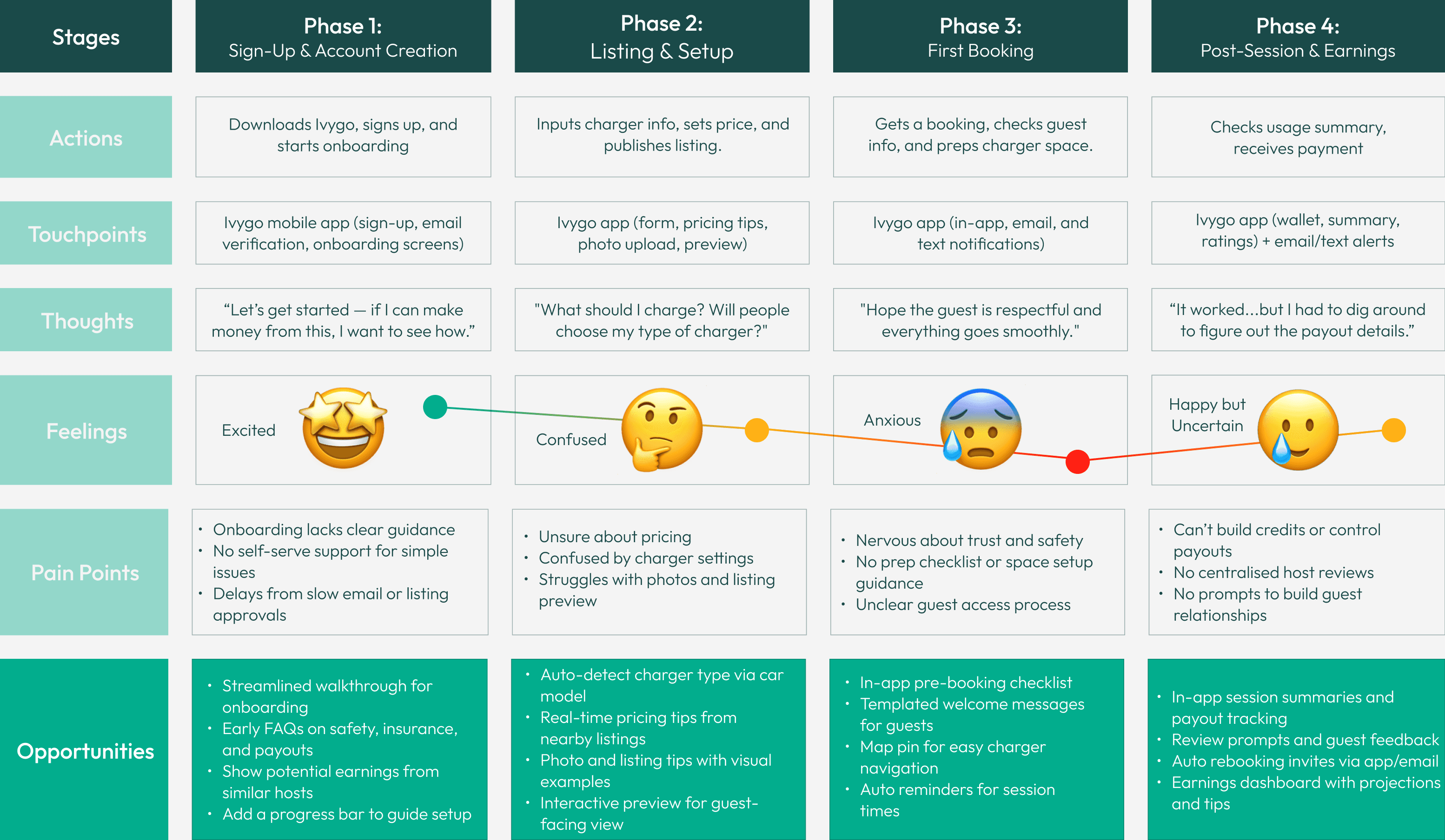
From here, I focused on phases 3 and 4 of the journey — the approval waiting period and the post-session summary — as they revealed key usability pain points and emotional friction that directly impacted host confidence and trust in the platform. These stages also presented clear opportunities for design improvement and impact.
Host Persona
Host Persona
Empathise
Define
Ideate
Prototype
Test
Implement
From my research and user interviews, I created a host persona to help focus the design around a real user’s goals, frustrations, and expectations. While personas are informed by the Empathise phase, they are a key part of the Define stage — helping turn raw insights into a clear understanding of the user and their needs.
Jordan Miles
Age:
Occupation:
Location:
38
Software Engineer
Melbourne
An eco-conscious, tech-savvy EV owner who works remotely and sees hosting as a hands-off way to earn passive income.
If my charger’s just sitting there, it might as well make money.
Motivations
Passive income
Maximising solar investment
Staying ahead of the curve
Pain Points
Manual effort
Guest reliability
Lack of session oversight
Reluctant to share bank info
Opportunities
Automation where possible
Rating & verification system
Real-time session tacking
Option for in-app credits
Journey Map
Journey Map
Define
To better understand the host experience, I mapped out their journey from sign-up to payout. This helped identify where frustrations occur and where design could better support their needs.
⬅ Scroll ➡
From here, I focused on phases 3 and 4 of the journey — the approval waiting period and the post-session summary — as they revealed key usability pain points and emotional friction that directly impacted host confidence and trust in the platform. These stages also presented clear opportunities for design improvement and impact.
Problem Statements & Hypotheses
Problem Statements & Hypotheses
Empathise
Define
Ideate
Prototype
Test
Implement
Based on my research and journey mapping, I defined clear problem statements and hypotheses to inform solutions that directly address user pain points in the approval and post-session stages.
1. Lack of a Dedicated Host Interface
Problem Statement
Hosts struggled with navigation because the guest/host interface doesn’t reflect their unique workflows.
Hypothesis
A dedicated host dashboard showing only relevant actions would improve confidence and usability.


2. Booking Approval Uncertainty
Problem Statement
Limited guest info and a vague approval flow left hosts unsure about booking requests.
Hypothesis
Trust would improve with booking cards showing guest details, ratings, verification, and a simple approval path.
3. No Real-Time Session Visibility
Problem Statement
Hosts felt anxious during charging sessions due to lack of live updates or visibility into activity at their property.
Hypothesis
A live session screen with usage info and quick access to support would help hosts feel more in control.


4. Lack of Automation & Payout Flexibility
Problem Statement
Hosts wanted a more passive experience, but had no automation or payout options.
Hypothesis
A session summary with ratings, auto-approve toggle, and payout controls would increase satisfaction and retention.
Low-Fidelity Prototypes: Sketching
Low-Fidelity Prototypes: Sketching
Empathise
Define
Ideate
Prototype
Test
Implement
After identifying key pain points and opportunities, I moved into the ideation phase. I began sketching potential solutions to address friction in the Host’s journey — from managing bookings to completing a charging session. These early sketches helped me quickly explore layout ideas and prioritise content.
Host Dashboard Concepts
These screens aim to give Hosts a clearer view of their bookings, availability, and recent session activity — all from a streamlined dashboard.


Booking Request & Approval
I explored how a Host might receive a booking request and what confirmation would look like once the booking is approved, ensuring key actions are intuitive.
Declined Requests & Sessions in Progress
These screens focus on keeping Hosts informed with real-time feedback — whether a booking is declined or a session is underway.


Session Complete & Payment Confirmation
Finally, I sketched how the session wrap-up would look, including confirmation of payment to give Hosts closure and transparency.
Peer feedback suggested separating the session summary and review, which led to an updated wireframe (below) with a clearer, more focused flow.
Low-Fidelity Prototypes: Wireframes
Low-Fidelity Prototypes: Wireframes
Empathise
Define
Ideate
Prototype
Test
Implement
At this stage, I created clickable low-fidelity prototypes (referred to as wireframes throughout this case study) to simulate key workflows and validate my hypotheses.
Each solution shown below was developed through sketching and iteration, directly addressing the core problems and hypotheses identified earlier.
1. Dedicated Host Interface
Solution
To reduce confusion, I added a simple toggle allowing users to switch between Host and Guest dashboards. This supports users who act in both roles and provides clear separation of workflows.
Rationale
Hosts don’t need a map view like Guests do — they care more about upcoming sessions, earnings, and availability.


2. Clear Booking Approval Workflow
Solution
The booking request appears front and centre when Hosts open the app — making action unavoidable. I added a checklist to reassure Hosts they’re prepared, a message field for custom instructions, and a reason field for declined bookings.
Informed By
User interviews indicating a need for clarity, confidence, and communication during bookings.
3. Real-Time Session Oversight
Solution
Hosts can view an active session with key details and a button for fast access to support. This screen was designed to help Hosts feel informed and in control.
Addresses
Need for session visibility and reduced anxiety during live charging.


4. Automation & Payout Flexibility
Solution
This flow includes a clear session summary, guest review screen, payment confirmation, and an auto-approve toggle.
Rationale
Based on user feedback, this feature supports trusted repeat Guests — streamlining future bookings without manual approval and making the hosting process more passive and automated.
Usability Testing
Usability Testing
Empathise
Define
Ideate
Prototype
Test
Implement
Before refining the visuals, I conducted usability testing on the low-fidelity prototype to uncover pain points, confusion, and opportunities to improve the flow. Each insight directly informed updates that I implemented in the final prototype.
1. Removing Unclear Labels
Insight
Users mistook the “Notification” label for a search bar.
Solution
I removed the label and added a bell icon in the top corner for cleaner, more intuitive access to notifications.
2. Overlapping Bookings
Insight
Participants wanted a better way to view multiple booking requests.
Solution
I added horizontal scroll functionality so Hosts can easily browse through overlapping bookings and compare times.

3. Car Details in Booking Request
Insight
Users wanted to know which car was arriving at a glance.
Solution
I included the vehicle type and number plate in the booking request card for better clarity and preparation.

4. Overly Formal Checklist
Insight
The “Is your charger ready?” checklist felt repetitive and too formal.
Solution
I replaced it with a more relaxed info section — still offering reassurance without adding an extra manual step.

5. Repeated Manual Instructions
Insight
Users didn’t want to re-type approval messages every time.
Solution
I introduced an auto-filled message with the option to customise, saving time while keeping flexibility.

1. Removing Unclear Labels
Insight
Users mistook the “Notification” label for a search bar.
Solution
I removed the label and added a bell icon in the top corner for cleaner, more intuitive access to notifications.
2. Overlapping Bookings
Insight
Participants wanted a better way to view multiple booking requests.
Solution
I added horizontal scroll functionality so Hosts can easily browse through overlapping bookings and compare times.
3. Car Details in Booking Request
Insight
Users wanted to know which car was arriving at a glance.
Solution
I included the vehicle type and number plate in the booking request card for better clarity and preparation.
4. Overly Formal Checklist
Insight
The “Is your charger ready?” checklist felt repetitive and too formal.
Solution
I replaced it with a more relaxed info section — still offering reassurance without adding an extra manual step.
5. Repeated Manual Instructions
Insight
Users didn’t want to re-type approval messages every time.
Solution
I introduced an auto-filled message with the option to customise, saving time while keeping flexibility.
High-Fidelity Prototype - Solutions Summary
High-Fidelity Prototype - Solutions Summary
Empathise
Define
Ideate
Prototype
Test
Implement
After applying insights from usability testing, I refined the interface into a high-fidelity prototype that prioritises simplicity, control, and clarity for Hosts — while staying grounded in the core problems uncovered during initial research. Below are key screens and interactions that bring the Host experience to life, along with explanations for my design decisions.
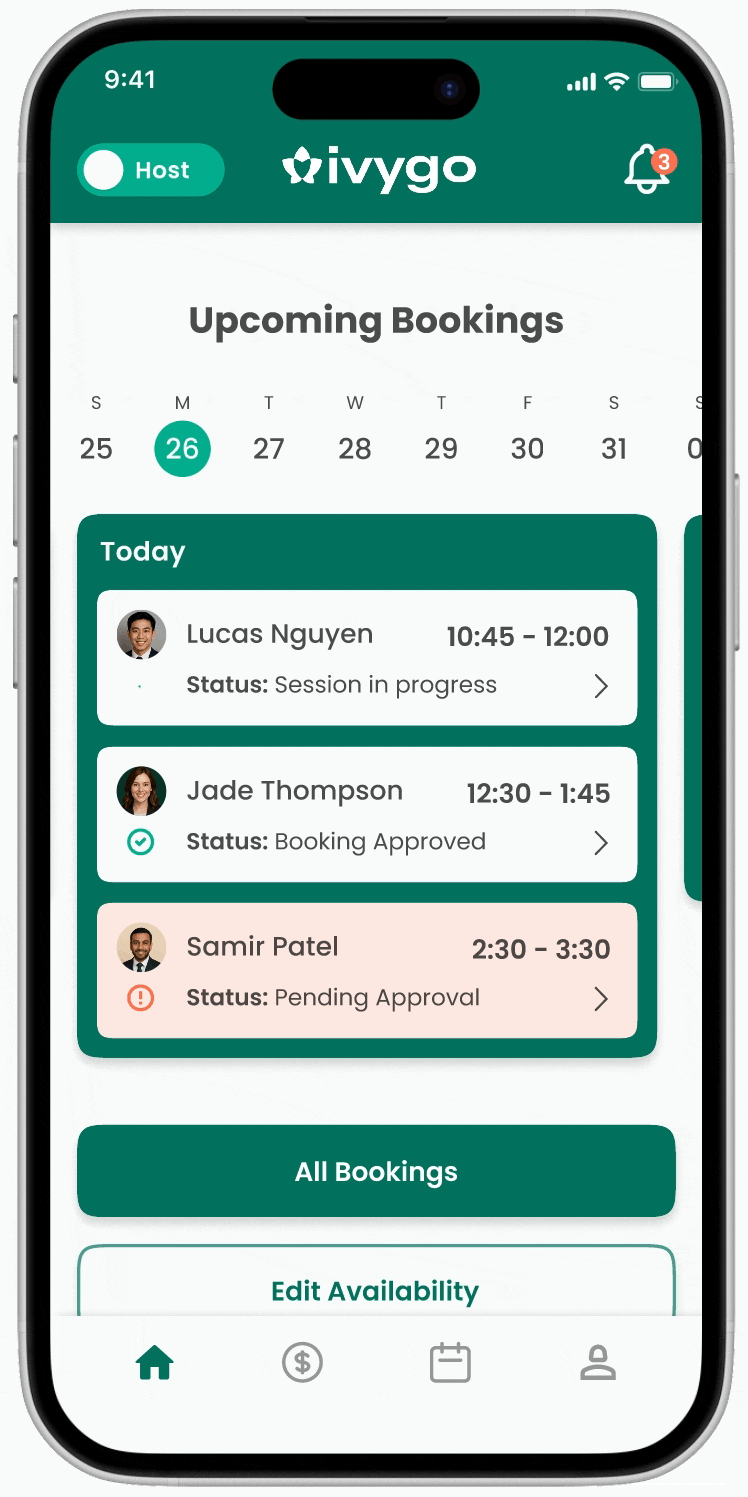
1. Dedicated Host Dashboard
Problem
The shared interface didn’t reflect the distinct needs of Hosts and Guests, making navigation confusing.
Stages Raised
Competitor analysis
User interviews
Journey map
Hypothesis 1
Design Solutions
A toggle to switch between Host and Guest views, giving users clarity and separating the two workflows.
A clean dashboard with Host-relevant features: a scrollable calendar to view bookings by day, clearly labelled booking statuses, and an earnings summary for quick financial oversight.
Rationale
Hosts don’t need a map view like Guests do, they care more about upcoming sessions, earnings, and availability.


2. Booking Request Clarity
Problem
Booking requests lacked key guest details (like ratings and verification), and the approval process was unclear with no obvious entry point for action.
Stages Raised
Competitor analysis
User interviews
Journey map
Hypothesis 2
Usability testing
Design Solutions
Booking requests show on launch to avoid missed actions
Pending approvals are highlighted and in notifications
Scrollable cards reveal overlapping bookings
Car details help identify guests quickly
Ratings and verification build trust
Rationale
These updates streamline the booking flow by improving visibility, reducing uncertainty, and supporting Host confidence.
3. Booking Decline User Flow
Problem
Hosts felt awkward declining bookings and wanted a way to maintain a positive relationship with Guests.
Stages Raised
User interviews
Design Solutions
A structured decline flow where Hosts select a reason and can include an optional message.
Rationale
This approach keeps interactions polite and transparent, helping Hosts feel more comfortable and Guests stay informed — reducing friction and potential misunderstandings.


4. Booking Approval User Flow
Problem
Hosts felt unsure how to prepare for guests, and usability testing revealed the checklist felt too formal and repetitive, and there was frustration around retyping instructions each time.
Stages Raised
User interviews
Journey map
Usability testing
Design Solutions
Replaced the checklist with a simple information section and added an auto-filled message that Hosts can edit before sending.
Rationale
This keeps Hosts informed and reassured without extra steps, while saving time and maintaining flexibility in communication.
5. Session In Progress Oversight
Problem
Hosts wanted more visibility and control during active charging sessions.
Stages Raised
Competitor analysis
User interviews
Journey map
Hypothesis 3
Design Solutions
Designed a live session card showing check-in time, duration, estimated usage, and finish time, along with options to message the guest or report issues.
Easily accessible from the dashboard.
Rationale
This gives Hosts real-time clarity and support options, reducing uncertainty and improving confidence during active sessions.


6. Session Complete Summary
Problem
Hosts felt unsure what happened after a session and wanted clearer closure and confirmation.
Stages Raised
User interviews
Journey map
Design Solutions
Created a summary screen with session details, usage, and total earnings.
Rationale
This gives Hosts peace of mind and a clear end point for each session.
7. Guest Review & Auto-Approval
Problem
Hosts wanted a more passive experience but lacked automation and a way to review guests.
Stages Raised
Competitor analysis
User interviews
Journey map
Hypothesis 4
Design Solutions
Added a star rating flow and written review option to help Hosts share feedback and support future trust-building.
Introduced an auto-approve toggle so Hosts can automate bookings for trusted guests.
Rationale
These features improve transparency, reduce repetitive tasks, and give Hosts more control over how they manage repeat bookings.


8. Payout Preferences & Earnings Dashboard
Problem
Hosts wanted more control over how they receive payments and better visibility of their overall earnings.
Stages Raised
User interviews
Journey map
Hypothesis 4
Design Solutions
Added the ability for Hosts to choose between bank transfers or Ivygo credit for receiving payments.
Designed an earnings summary dashboard with views for weekly, monthly, and all-time totals.
Rationale
This gives Hosts flexibility in how they manage income and a clear understanding of their financial performance.
Implementation
Implementation
Empathise
Define
Ideate
Prototype
Test
Implement
While implementation wasn’t a core focus of this project, I mapped each feature based on assumed value vs. development effort to support prioritisation. These are high-level assessments, as I didn’t have access to exact dev cost estimates.
Feature Prioritisation
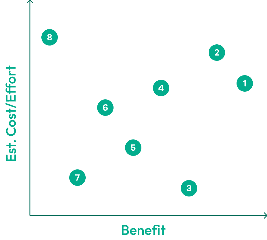
Review & rating system
Essential for trust; medium–high effort.
Host-guest differentiation
Improves clarity; higher effort due to dual UI.
Notification badge
High value, likely low effort — improves visibility.
Payments dashboard
Strong value; may require moderate–high effort.
Session summary screen
Low–moderate effort if based on existing data.
Session progress screen
Valuable but usage estimates may raise effort.
Auto-approve functionality
Low-effort, optional feature for convenience.
Ivygo credit system
Low user interest; high effort — lower priority.
Future Recommendations
Time-blocked visuals for overlapping bookings (like Google Calendar or Teams)
Gamified progress bar for Host milestones and earnings
Option to download earnings summaries as PDFs
In-app messaging for direct communication and increased confidence
Key Takeaways
Key Takeaways
This project gave me the opportunity to:
Design for both user needs and business goals in a dual-role app environment
Balance feature scope with technical feasibility
Apply feedback from usability testing to improve clarity and reduce friction
Strengthen my ability to prioritise and justify design decisions
Some key challenges I faced were:
Designing for two user types in one app: balancing the needs of Hosts and Guests without overwhelming the interface required careful workflow separation and prioritisation.
Working without technical constraints: without direct access to developers, I had to make educated assumptions around implementation effort and feasibility.
Avoiding friction in the Host flow: small UX details like how and when Hosts approve bookings made a big difference — it took iteration and testing to get the right balance of clarity and simplicity.
If I had more time, I would have loved to:
Conduct another round of testing on the high-fidelity prototype
Collaborate with a developer to better understand technical constraints
Further explore gamification and messaging features
Problem Statements & Hypotheses
Empathise
Define
Ideate
Prototype
Test
Implement
Based on my research and journey mapping, I defined clear problem statements and hypotheses to inform solutions that directly address user pain points in the approval and post-session stages.
1. Lack of a Dedicated Host Interface
Problem Statement
Hosts struggled with navigation because the guest/host interface doesn’t reflect their unique workflows.
Hypothesis
A dedicated host dashboard showing only relevant actions would improve confidence and usability.
2. Booking Approval Uncertainty
Problem Statement
Limited guest info and a vague approval flow left hosts unsure about booking requests.
Hypothesis
Trust would improve with booking cards showing guest details, ratings, verification, and a simple approval path.
3. No Real-Time Session Visibility
Problem Statement
Hosts felt anxious during charging sessions due to lack of live updates or visibility into activity at their property.
Hypothesis
A live session screen with usage info and quick access to support would help hosts feel more in control.
4. Lack of Automation & Payout Flexibility
Problem Statement
Hosts wanted a more passive experience, but had no automation or payout options.
Hypothesis
A session summary with ratings, auto-approve toggle, and payout controls would increase satisfaction and retention.
Low-Fidelity Prototypes: Sketching
Empathise
Define
Ideate
Prototype
Test
Implement
After identifying key pain points and opportunities, I moved into the ideation phase. I began sketching potential solutions to address friction in the Host’s journey — from managing bookings to completing a charging session. These early sketches helped me quickly explore layout ideas and prioritise content.
Host Dashboard Concepts
These screens aim to give Hosts a clearer view of their bookings, availability, and recent session activity — all from a streamlined dashboard.
Booking Request & Approval
I explored how a Host might receive a booking request and what confirmation would look like once the booking is approved, ensuring key actions are intuitive.
Declined Requests & Sessions in Progress
These screens focus on keeping Hosts informed with real-time feedback — whether a booking is declined or a session is underway.
Session Complete & Payment Confirmation
Finally, I sketched how the session wrap-up would look, including confirmation of payment to give Hosts closure and transparency.
Peer feedback suggested separating the session summary and review, which led to an updated wireframe (below) with a clearer, more focused flow.
Low-Fidelity Prototypes: Wireframes
Empathise
Define
Ideate
Prototype
Test
Implement
At this stage, I created clickable low-fidelity prototypes (referred to as wireframes throughout this case study) to simulate key workflows and validate my hypotheses.
Each solution shown below was developed through sketching and iteration, directly addressing the core problems and hypotheses identified earlier.
1. Dedicated Host Interface
Solution
To reduce confusion, I added a simple toggle allowing users to switch between Host and Guest dashboards. This supports users who act in both roles and provides clear separation of workflows.
Rationale
Hosts don’t need a map view like Guests do — they care more about upcoming sessions, earnings, and availability.
2. Clear Booking Approval Workflow
Solution
The booking request appears front and centre when Hosts open the app — making action unavoidable. I added a checklist to reassure Hosts they’re prepared, a message field for custom instructions, and a reason field for declined bookings.
Informed By
User interviews indicating a need for clarity, confidence, and communication during bookings.
3. Real-Time Session Oversight
Solution
Hosts can view an active session with key details and a button for fast access to support. This screen was designed to help Hosts feel informed and in control.
Addresses
Need for session visibility and reduced anxiety during live charging.
4. Automation & Payout Flexibility
Solution
This flow includes a clear session summary, guest review screen, payment confirmation, and an auto-approve toggle.
Rationale
Based on user feedback, this feature supports trusted repeat Guests — streamlining future bookings without manual approval and making the hosting process more passive and automated.
Usability Testing
Empathise
Define
Ideate
Prototype
Test
Implement
Before refining the visuals, I conducted usability testing on the low-fidelity prototype to uncover pain points, confusion, and opportunities to improve the flow. Each insight directly informed updates that I implemented in the final prototype.
1. Removing Unclear Labels
Insight
Users mistook the “Notification” label for a search bar.
Solution
I removed the label and added a bell icon in the top corner for cleaner, more intuitive access to notifications.
2. Overlapping Bookings
Insight
Participants wanted a better way to view multiple booking requests.
Solution
I added horizontal scroll functionality so Hosts can easily browse through overlapping bookings and compare times.
3. Car Details in Booking Request
Insight
Users wanted to know which car was arriving at a glance.
Solution
I included the vehicle type and number plate in the booking request card for better clarity and preparation.
4. Overly Formal Checklist
Insight
The “Is your charger ready?” checklist felt repetitive and too formal.
Solution
I replaced it with a more relaxed info section — still offering reassurance without adding an extra manual step.
5. Repeated Manual Instructions
Insight
Users didn’t want to re-type approval messages every time.
Solution
I introduced an auto-filled message with the option to customise, saving time while keeping flexibility.
High-Fidelity Prototype - Solutions Summary
Empathise
Define
Ideate
Prototype
Test
Implement
After applying insights from usability testing, I refined the interface into a high-fidelity prototype that prioritises simplicity, control, and clarity for Hosts — while staying grounded in the core problems uncovered during initial research. Below are key screens and interactions that bring the Host experience to life, along with explanations for my design decisions.
1. Dedicated Host Dashboard
Problem
The shared interface didn’t reflect the distinct needs of Hosts and Guests, making navigation confusing.
Stages Raised
Competitor analysis
User interviews
Journey map
Hypothesis 1
Design Solutions
A toggle to switch between Host and Guest views, giving users clarity and separating the two workflows.
A clean dashboard with Host-relevant features: a scrollable calendar to view bookings by day, clearly labelled booking statuses, and an earnings summary for quick financial oversight.
Rationale
Hosts don’t need a map view like Guests do, they care more about upcoming sessions, earnings, and availability.
2. Booking Request Clarity
Problem
Booking requests lacked key guest details (like ratings and verification), and the approval process was unclear with no obvious entry point for action.
Stages Raised
Competitor analysis
User interviews
Journey map
Hypothesis 2
Usability testing
Design Solutions
Booking requests show on launch to avoid missed actions
Pending approvals are highlighted and in notifications
Scrollable cards reveal overlapping bookings
Car details help identify guests quickly
Ratings and verification build trust
Rationale
These updates streamline the booking flow by improving visibility, reducing uncertainty, and supporting Host confidence.
3. Booking Decline User Flow
Problem
Hosts felt awkward declining bookings and wanted a way to maintain a positive relationship with Guests.
Stages Raised
User interviews
Design Solutions
A structured decline flow where Hosts select a reason and can include an optional message.
Rationale
This approach keeps interactions polite and transparent, helping Hosts feel more comfortable and Guests stay informed — reducing friction and potential misunderstandings.
4. Booking Approval User Flow
Problem
Hosts felt unsure how to prepare for guests, and usability testing revealed the checklist felt too formal and repetitive, and there was frustration around retyping instructions each time.
Stages Raised
User interviews
Journey map
Usability testing
Design Solutions
Replaced the checklist with a simple information section and added an auto-filled message that Hosts can edit before sending.
Rationale
This keeps Hosts informed and reassured without extra steps, while saving time and maintaining flexibility in communication.
5. Session In Progress Oversight
Problem
Hosts wanted more visibility and control during active charging sessions.
Stages Raised
Competitor analysis
User interviews
Journey map
Hypothesis 3
Design Solutions
Designed a live session card showing check-in time, duration, estimated usage, and finish time, along with options to message the guest or report issues.
Easily accessible from the dashboard.
Rationale
This gives Hosts real-time clarity and support options, reducing uncertainty and improving confidence during active sessions.
6. Session Complete Summary
Problem
Hosts felt unsure what happened after a session and wanted clearer closure and confirmation.
Stages Raised
User interviews
Journey map
Design Solutions
Created a summary screen with session details, usage, and total earnings.
Rationale
This gives Hosts peace of mind and a clear end point for each session.
7. Guest Review & Auto-Approval
Problem
Hosts wanted a more passive experience but lacked automation and a way to review guests.
Stages Raised
Competitor analysis
User interviews
Journey map
Hypothesis 4
Design Solutions
Added a star rating flow and written review option to help Hosts share feedback and support future trust-building.
Introduced an auto-approve toggle so Hosts can automate bookings for trusted guests.
Rationale
These features improve transparency, reduce repetitive tasks, and give Hosts more control over how they manage repeat bookings.
8. Payout Preferences & Earnings Dashboard
Problem
Hosts wanted more control over how they receive payments and better visibility of their overall earnings.
Stages Raised
User interviews
Journey map
Hypothesis 4
Design Solutions
Added the ability for Hosts to choose between bank transfers or Ivygo credit for receiving payments.
Designed an earnings summary dashboard with views for weekly, monthly, and all-time totals.
Rationale
This gives Hosts flexibility in how they manage income and a clear understanding of their financial performance.
Implementation
Empathise
Define
Ideate
Prototype
Test
Implement
While implementation wasn’t a core focus of this project, I mapped each feature based on assumed value vs. development effort to support prioritisation. These are high-level assessments, as I didn’t have access to exact dev cost estimates.
Feature Prioritisation
Review & rating system
Essential for trust; medium–high effort.
Host-guest differentiation
Improves clarity; higher effort due to dual UI.
Notification badge
High value, likely low effort — improves visibility.
Payments dashboard
Strong value; may require moderate–high effort.
Session summary screen
Low–moderate effort if based on existing data.
Session progress screen
Valuable but usage estimates may raise effort.
Auto-approve functionality
Low-effort, optional feature for convenience.
Ivygo credit system
Low user interest; high effort — lower priority.
Future Recommendations
Time-blocked visuals for overlapping bookings (like Google Calendar or Teams)
Gamified progress bar for Host milestones and earnings
Option to download earnings summaries as PDFs
In-app messaging for direct communication and increased confidence
Key Takeaways
This project gave me the opportunity to:
Design for both user needs and business goals in a dual-role app environment
Balance feature scope with technical feasibility
Apply feedback from usability testing to improve clarity and reduce friction
Strengthen my ability to prioritise and justify design decisions
Some key challenges I faced were:
Designing for two user types in one app: balancing the needs of Hosts and Guests without overwhelming the interface required careful workflow separation and prioritisation.
Working without technical constraints: without direct access to developers, I had to make educated assumptions around implementation effort and feasibility.
Avoiding friction in the Host flow: small UX details like how and when Hosts approve bookings made a big difference — it took iteration and testing to get the right balance of clarity and simplicity.
If I had more time, I would have loved to:
Conduct another round of testing on the high-fidelity prototype
Collaborate with a developer to better understand technical constraints
Further explore gamification and messaging features
User Interview Insights
User Interview Insights
Empathise
Define
Ideate
Prototype
Test
Implement
I interviewed 5 users who were either current Ivygo hosts or open to using the platform as a host, guest, or both. The goal was to uncover their expectations, concerns, and what features would make them feel confident, in control, and motivated to engage with the app.
Trust Signals are Essential
They all wanted a rating or review system to feel safe letting strangers access their property.
100%
Wanted a rating & review system
I’d want a rating or photo — something to show they’re not dodgy.
Passive Hosting is the Goal
Manual actions like approving bookings or sending messages discouraged ongoing use.
60%
Wanted a passive experience
If it just ran in the background, I’d actually use it.
Clear Role Separation
Many participants were open to both hosting and charging, but the app doesn’t clearly distinguish between the two roles.
80%
Wanted clear host navigation
I don’t know where to go to approve a booking, it just feels like a charger search tool.
Real-Time Session Visibility
Most wanted updates on check-in, session start, and session completion to feel confident during bookings.
60%
Wanted session oversight
I’d want to know when they arrive and that it’s working — otherwise I’m just guessing.
Flexible Payout Options
Some preferred to earn Ivygo credit first rather than share banking info up front. Others stressed the need for clear session breakdowns.
40%
Wanted an in-app credit option
I’d rather earn credit first than give my bank details upfront.
Other Insights
Hosts felt awkward declining bookings and wanted a way to maintain a positive relationship with Guests.
Hosts weren’t sure what to do after approving a booking and wanted reassurance they were prepared.
Hosts felt unsure what happened after a session and wanted clearer closure and confirmation.